
Featured posts


Latest blog posts
Featured


June is usually our most productive month for solar. This year, we took a deep dive into the data to see how our system handled varying weather conditions—from heatwaves to rain. We’ve broken down every kWh to show you exactly how our smart energy management performed during this period.
Solar panel performance declines over the years. I thought it might be interesting to see how mine compares. Of course weather comes into it, but hopefully this will be a useful guide.
We've had some changes with the arrival of our electric car, making this month one of our most efficient yet! Our solar generation covered almost 100% of house usage, proving that smart planning and new tariffs pay off.
April was a massive month for solar! We hit 91% self-sufficiency and saw record generation, proving that strategic battery management can make a huge difference to your bills.
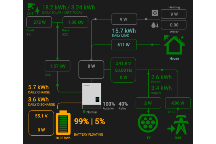
If you use the Sunsynk dashboard, you know how crucial accurate energy monitoring is. We recently ran into a tricky issue after adding the Octopus EV charger,. House consumption included the heat pump. We wanted to split it out.
This is my favourite power flow card for Home AssistantFor ages, we just had raw data. We desperately wanted one clear graph showing our daily electricity costs on our smart home dashboard. Plotly was the tool, but the learning curve was real. Here’s how we finally made it work!
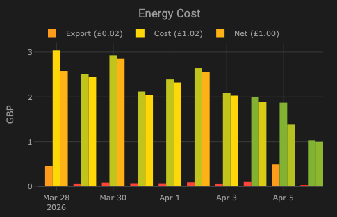
March started with promise but faced some cloudy days. We look at our generation figures, battery performance, and how the changing weather impacted our grid usage and costs.
A very wet and overcast month led to our lowest February generation figures in recent memory. Despite some bright days, our panels struggled under the gloom, resulting in zero self-sustained days this period. Read on for our full breakdown of battery usage and cost savings.